Omaze

Designing and scaling a subscription-first recurring revenue product through behavioural experimentation

Industry:

E-commerce / Subscriptions

Year:

2025-2026

Team:

1 x Product Designer

2 x Engineers

2 x Product Manager

Growth Team

CRM

Contributions:

Product Design

UX Strategy

Design Experimentation

Branding

User Experience

Conversion Optimisation

Turning a price increase into a recurring revenue engine

Business Context

Client Website

arrow east

The subscription price went up and the business had to justify it.

In August 2025, Omaze increased its core subscription price from £10 to £15. To mitigate potential backlash and protect retention, the business introduced a new value proposition: a monthly one million pounds prize experience included "free" within all tier subscriptions.

The product, The Omaze Monthly Millionaire, internally positioned as a free add-on to a monthly subscription-based package, was also available as Pay-As-You-Go (PAYG). The commercial objective was clear: mitigate price increase backlash, increase subscription uptake, improve lifetime value, offset high customer acquisition costs, and generate predictable and stabilised monthly recurring revenue.

This wasn't just a marketing addition. It was a new recurring revenue layer created to meet a potentially sensitve business moment.

The opportunity: Design and optimise a high-acquisition-cost landing page for a new draw experience and turn it into a scalable subscription conversion engine.

The Opportunity

The revenue forecast was £1M+ per month. Initial launch performance came in at ~£650k, a gap that needed closing through design and experimentation. Early on, we identified the challenges that we needed to work on as business, if we wanted to make The Omaze Monthly Millionaire into a successful Omaze product.

The challenge sat at the intersection of two competing pressures. The business needed to protect and grow recurring revenue without cannibalising PAYG sales. Users needed clarity, confidence, and a mobile-first experience that didn't feel like a hard sell.

Business Needs

Solution #1

#1

  • Protect recurring revenue
  • Increase subscription uptake
  • Avoid PAYG cannibalisation

User Needs

Solution #1

#1

  • Clear value articulation
  • Confidence & trust
  • Avoid PAYG cannibalisation

Converting low-intent, paid traffic into long-term subscribers

Challenges

Initial launch performance underdelivered. The first iteration of the page, constrained by pre-existing out-of-the-box Shopify components, generated ~£650k in revenue, significantly below the £1M+ forecast.

A later Meta funnel analysis session with senior PMs highlighted critical mobile behaviour insights: users interact predominantly with the bottom half of mobile screens, and three elements must appear instantly: trust, value clarity, and conversion options.

This reframed the page not as a marketing surface, but as a mobile-first behavioural system that needed immediate redesign.

Challenge 1

#1

Weak value articulation

No clear value proposition above the fold. Users couldn't immediately understand what they were committing to.

Challenge 2

#2

Limited trust signals

No visible social proof, no third-party validation, and no authentic testimonials to reduce scepticism.

Challenge 3

#2

Poor price anchoring

PAYG-only emphasis with subscription value under-communicated. Users were evaluating price rather than value.

Challenge 4

#4

No urgency or clarity

No structured "how it works" section, no countdown, and no urgency to drive immediate action.

Phased Delivery

Three phases, from constraint to confidence.

Phase 1

#1

Launch under
constraints

Initial launch using pre-existing Shopify components. Established baseline metrics and surfaced key behavioural frictions from live traffic data.

Phase 2

#2

Foundational mobile-first redesign

Complete page rebuild with clear value hierarchy, persistent CTAs, modular payment architecture, and improved content scannability.

Phase 3

#3

Structured experimentation

Hypothesis-driven A/B testing cycle targeting mobile first principles, trust, emotion, value framing, and subscription positioning.

Redesign

The redesign was built around observed mobile behavioural patterns from paid Meta traffic. Every element was optimised for thumb-accessible interaction and instant value comprehension, particularly for an older demographic (internal data shows that a large part of Omaze's customer base are people aged 45+).

Mobile-first approach

Solution #1

#1

  • Clear value hierarchy above the fold
  • Large typography for older demographics
  • Persistent bottom CTA (thumb-accessible)
  • Winner testimonials as social proof
  • Video testimonials for emotional engagement
  • Improved scannability across all sections

Testing what actually moves the needle

Hypothesis Framework

If we build trust, reduce uncertainty, and anchor value toward subscription… then we increase subscription conversion and recurring revenue without harming PAYG revenue.

Each experiment was designed around a specific behavioural hypothesis, tested against control, and measured on conversion, revenue, and subscription metrics.

Nudging Behaviour

Users weren't rejecting the price. They were unsure what they were committing to.

Identifying key frictions, I translated high-level behavioural assumptions into modular, testable experiments, each tied to conversion rate, subscription attachment, and revenue per visitor as core success metrics.

This reframed the page not as a marketing surface, but as a mobile-first behavioural system.

The opportunity: Users interact bottom-half first. Add more trust signals. Value must appear instantly. More focus on subscription.

Key Friction #1

#1

Mobile-first

Experience needs mobile-first foundational principles

Key Friction #2

#2

Trust

No trust signals or social proof

Key Friction #3

#1

Value

Weak above-the-fold value proposition

Key Friction #4

#2

PAYG-only

PAYG-first emphasis deprioritising subscriptions

Experiment #1

Solution #1

#1

Building trust

Trust reduces hesitation. Adding third-party validation and authentic testimonials will reduce perceived risk and increase conversion.

Winner: TrustPilot testimonials + rating placed above the fold
Result: +7.3% CVR

Experiment #2

Solution #1

#1

Adding emotion

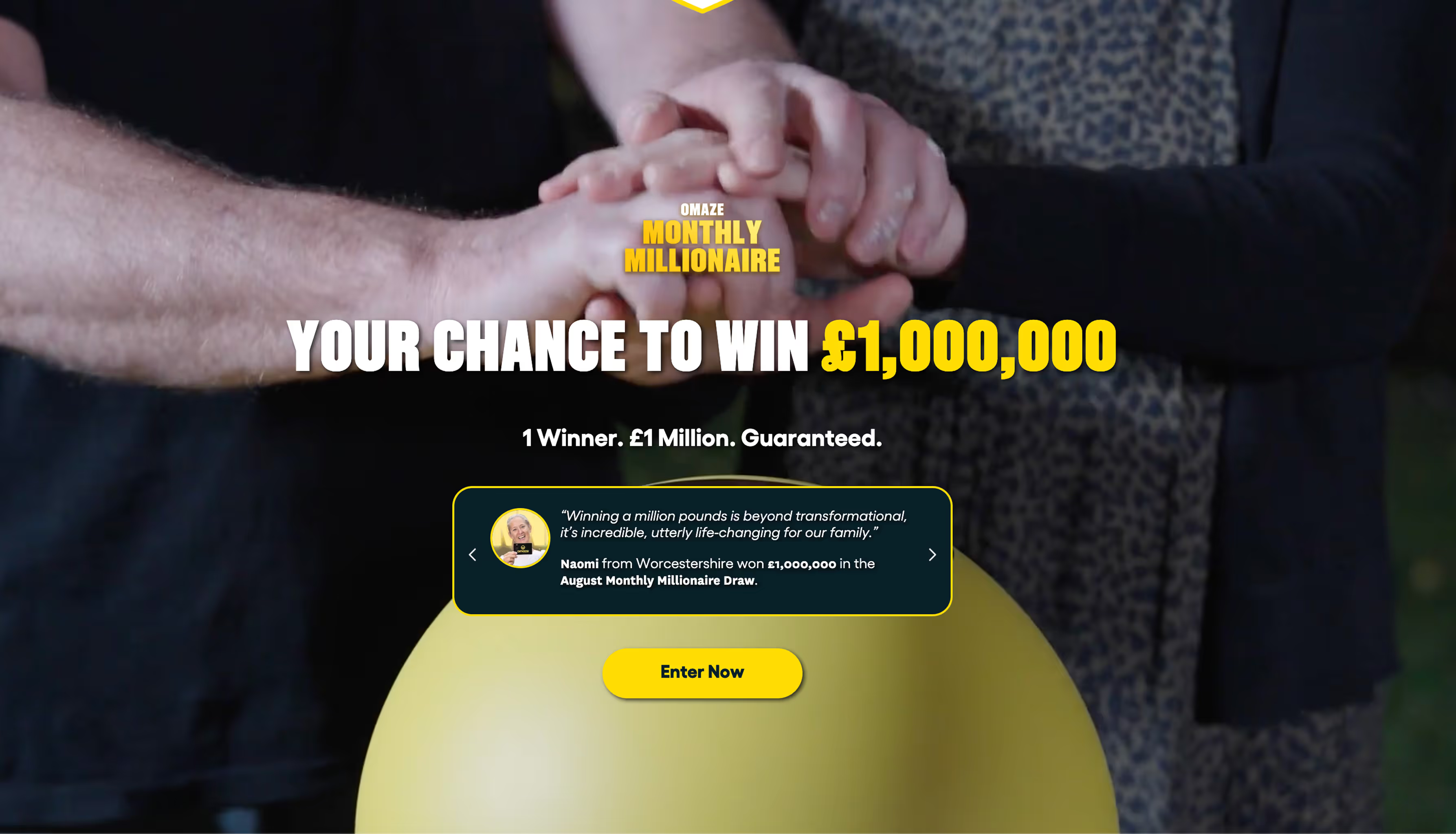
Emotion drives action. Winner reaction video content above the fold will strengthen emotional salience and increase engagement.

I created an emotional video pieced together from the winner reaction videos available internally and added it as a looped background to the hero.

Winner: Winner reaction video placed above fold
Result: +4.8% CVR

Experiment #3

Solution #1

#1

Value framing

Subscription must feel superior, not secondary. Reframing payment options to emphasise entry volume over price will shift cognitive anchoring toward value.

Winner: Surface subscription early. Visually prioritise subscription card with "Best Value" positioning.
Result: +8.5% CVR · No PAYG cannibalisation

Not just a landing page. A revenue system.

Systems Thinking

The Omaze Monthly Millionaire This wasn't a single redesign, it was a continuous optimisation system. Each iteration built on the last, compounding behavioural and revenue gains over time in order to understand what makes users buy in the experience.

Solution #1

#1

  • Modular experimentation within CMS constraints
  • Behavioural psychology applied at scale
  • Subscription-first product thinking
  • Data-informed iteration cycles
  • Mobile acquisition optimisation

Impact

Key Results

+

35%

Overall conversion uplift

+

£1.5M

Monthly revenue achieved

+

£1M

Sustained monthly revenue

Personal Insights

What this project taught me

Creating a new draw experience 0 to 1, from branding and to conversion optimisation, shifted how I think about product design: from crafting interfaces to engineering conversion systems. It challenged me to balance commercial pressure with user experience, and to prove that design decisions can directly move revenue metrics.

Working within Shopify constraints while running structured A/B experiments taught me to be scrappy without sacrificing strategic rigour. And ultimately, it reinforced my belief that the best product design isn't just usable, it's measurably impactful.

Go to the Monthly Millionaire Website

Want to know more about my skills and expertise?hello@irinacsapo.co.uk

View my CV
Irina Csapo - Profile Photo - 2024

Thanks for being here!
Let’s work together.hello@irinacsapo.co.uk

Say Hello.